
“Number one: no one is like me.” — Harley Quinn
“They say if you want to tell a story right, you gotta start at the beginning,” chirps the titular heroine in the opening moments of Birds of Prey: And the Fantabulous Emancipation of One Harley Quinn.
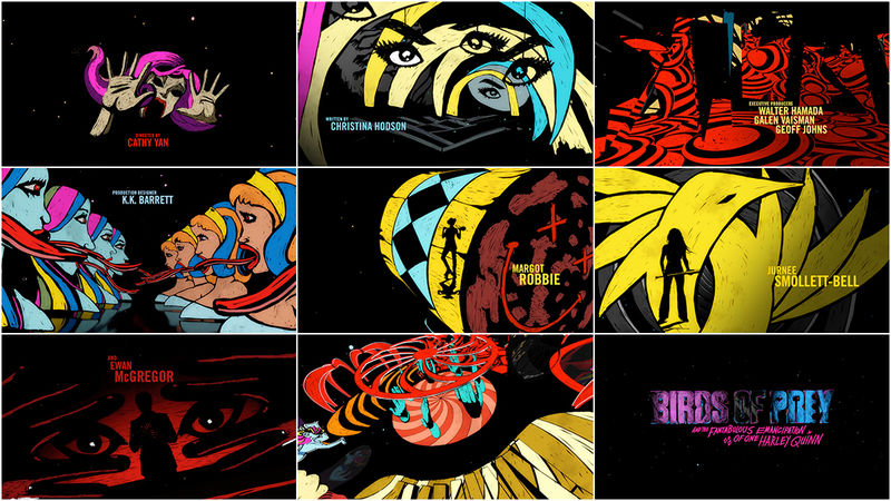
Director Cathy Yan’s Birds of Prey is a jittery, glittery joyride through loss, independence, sisterhood and gory vengeance. Graphics burst forward at every opportunity, bright and multicoloured, neon and shining. Like its central figure, they cannot be contained. At the film’s head and tail are a perky cartoon prologue and a vibrant, illustrated closer, respectively, created by two different teams and linked through colour and typography.
Kicking off the film is a spritely sequence by Warner Bros. Animation that exudes Powerpuff energy and neatly sums up the punchy PhD’s provenance, from bouncing babe to Joker paramour and the events of Suicide Squad, so that, thankfully, nobody has to watch that again.
The film’s mouthful of a title appears after Quinn drives a truck carrying flammables into a chemical refinery. The collision ignites a gorgeous explosion of enormous proportions and the title logo, produced by studio Filmograph, shimmers darkly in the sky above.
It is Quinn’s spunky voice – Margot Robbie delivering a cracked Brooklyn cheerleader fuelled by egg sandwiches and rage – that leads the way through this balls-to-the-wall post-break-up bonanza. As main characters appear on screen, their names appear alongside them, customized to the individual. Minor characters seeking revenge are given graphic names and grievances scribbled in red, blue, yellow, and hot green, an extension of Quinn’s scattered psyche.
After delivering one manic melee after another, the film finishes with a main-on-end title sequence doused in vast swaths of colour and looped in loose, agitated lines that blink, swing and bleed into the shapes of key setpieces. To create the end sequence, design studio Shine took inspiration from the film’s production design and turned to a tool that hasn’t historically been used for big-budget Hollywood productions: Procreate, Apple’s graphics software for iPad. We chat with Shine about their workflow, the directions that didn’t make it, and how they used Procreate with After Effects and Cinema 4D to create the sequence’s uniquely scrappy look.
A discussion with Creative Director MICHAEL RILEY of Shine and Lead Animator PENELOPE NEDERLANDER.
Michael, your studio, Shine, has been around a long time so it’s a pleasure to finally chat! Tell me a bit about Shine.
MR: Shine is a small studio. At any given time we’ll have myself, four designer-animators, an editor and a production assistant. We grow when there’s more stuff going on and then we come back down to this size as a constant. We’re lucky to have a lot of repeat clients, mostly broadcast and streaming – some are film, some are advertising. We do some…
RSS & Email Subscribers: Check out the full Birds of Prey: And the Fantabulous Emancipation of One Harley Quinn article at Art of the Title.


