The release of the former Wii U exclusive Yoshi’s Woolly World to the Nintendo 3DS demonstrates once again that gaming menus are best when they’re lists. Nothing fancier is needed. We don’t need to be able to wander every which way through them.
Both versions of Woolly World are sidescrollers. They pretty much have the same levels. But the Wii U game presents its menus on a walkable 2D plane. The 3DS game presents them as straight lines. Guess which one is more convenient to use?
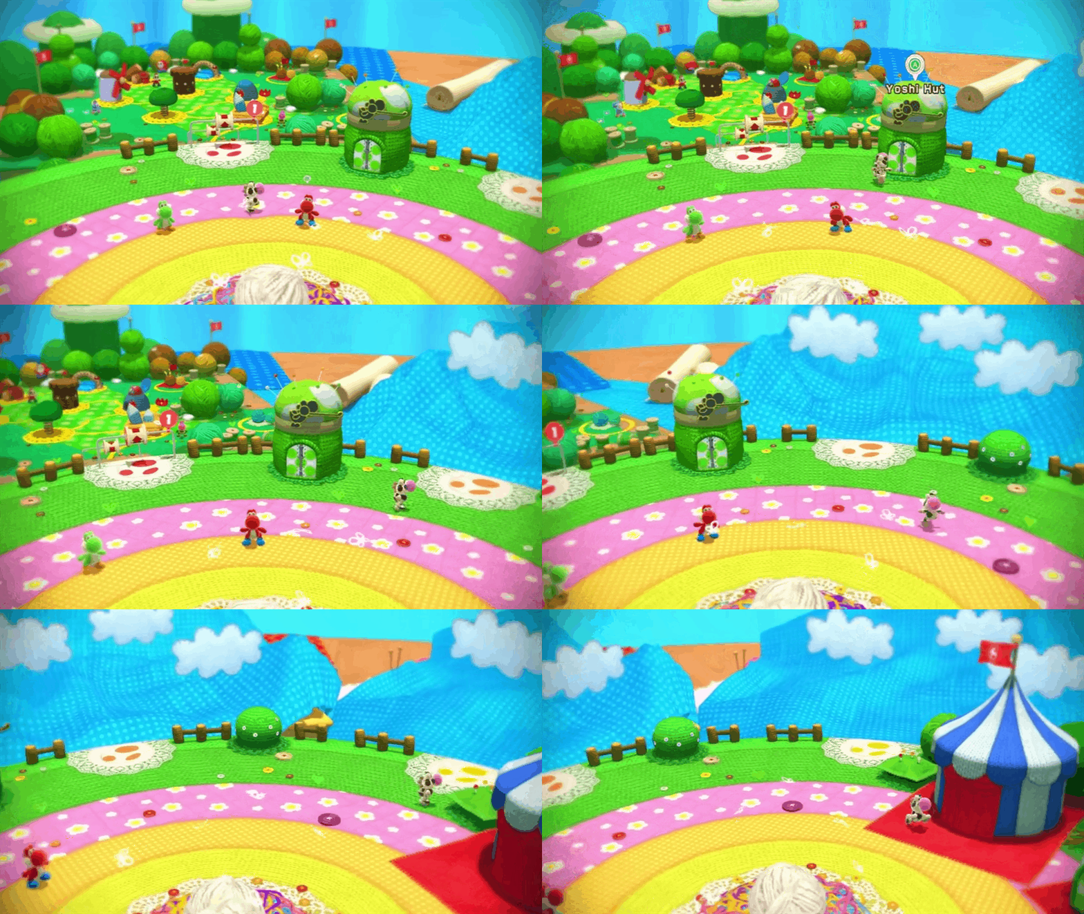
Here’s the main menu of the Wii U version of the game. In it, you must walk Yoshi around a circular area, going from a hut for swapping Yoshis to another hut for doing Amiibo stuff and so on.

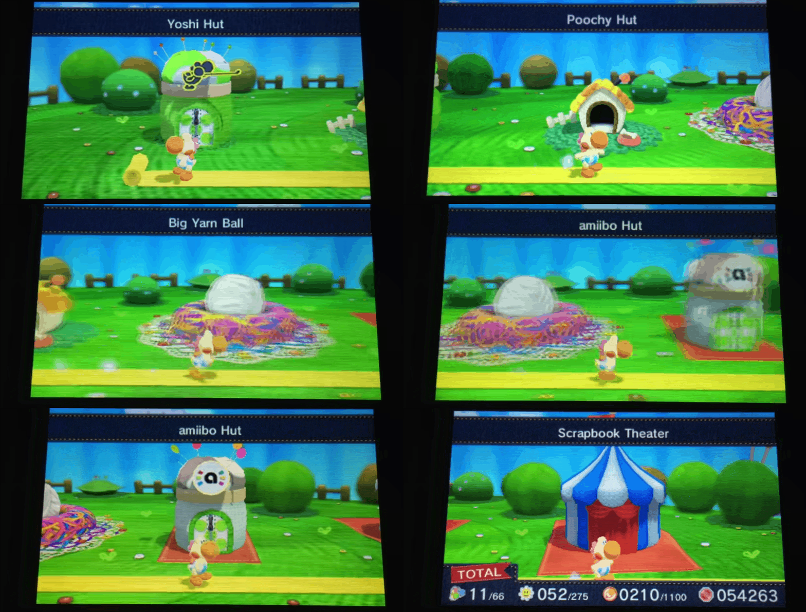
Here is the new 3DS version of that, all laid out in one nice straight line…

Another example: This is how you pick which of the game’s levels you want to play. Yoshi’s got to walk to each one wandering around a little field:
And here’s how they do it in the 3DS version…
There no doubt that the Wii U game is prettier. Its menu areas look way nicer than the 3DS game’s. But menus aren’t about looking pretty. They’re about showing you your options and letting you get to stuff quickly.
Sometimes 2D is better than 3D. In this case, give me a 1D menu over a 2D one any day.

